The Socioeconomics dashboard in the Semrush Traffic & Market Toolkit reveals the economic and lifestyle characteristics of any competitor or market audience. It provides data on household size, income level, employment status, and education level.
Use this dashboard to gain a deeper understanding of audience composition, segment users by financial and professional background, and tailor your messaging to real-world socioeconomic profiles.
Getting started with the Socioeconomics dashboard
The Get Started menu is your entry point into the Semrush Traffic & Market Toolkit. It’s designed to help you quickly enter domains and move into your analysis of their traffic and marketing performance.
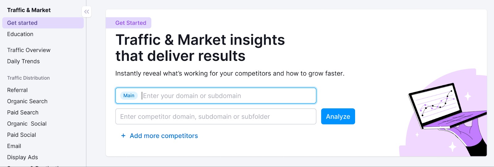
You’ll use this page to kick off your analysis—it’s your launchpad into the entire Traffic & Market experience.
If you haven’t started any analyses yet, you’ll see a search panel where you can:
- Type in a domain — Start by entering the main domain you’d like to analyze
- Add additional competitors — Use the “+ Add more competitors” link to compare multiple sites at once
- Click the “Analyze” button — This will pull up dashboards with data and charts, starting with the Traffic Overview dashboard
If you’ve already entered domains into the toolkit, you’ll see them saved as “Folders” and you can access them anytime.
In this case, you’ll see your saved folders listed on the Get Started screen. Click any one of them to jump straight into your dashboards and pick up right where you left off.
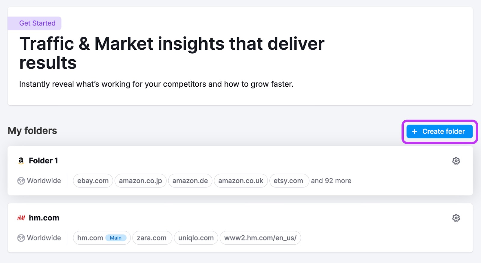
Use the “Create Folder” button to start a new project whenever you're analyzing a new domain or market.
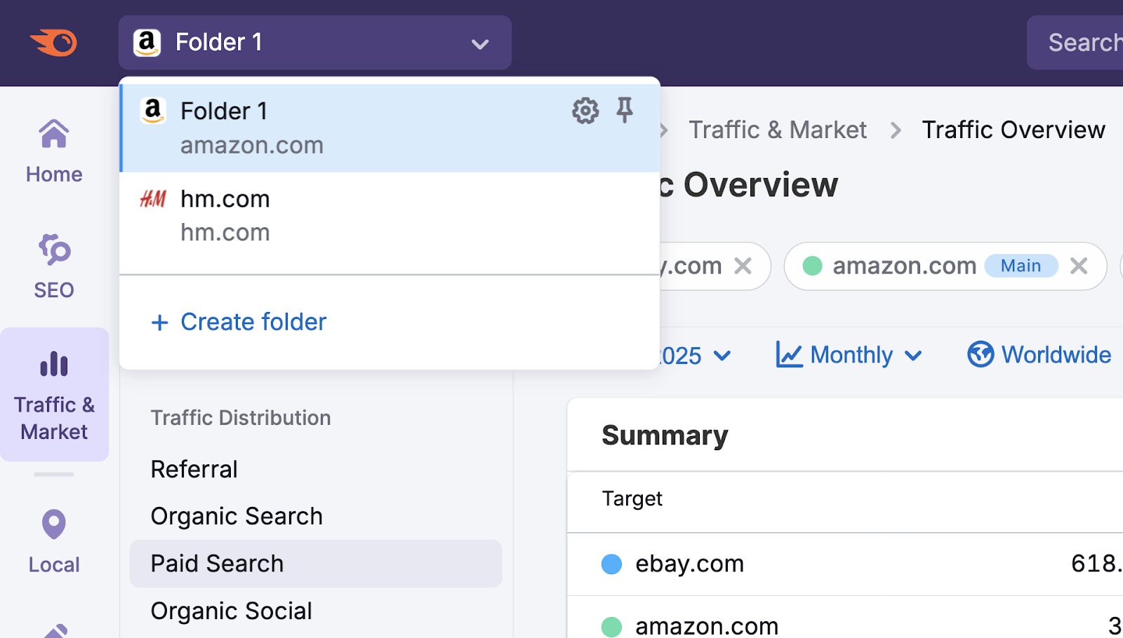
Note: At any time inside any dashboard, you can select the Competitor list drop-down in the upper left to edit your current list or create a different one without losing your place.
How to use the Socioeconomics dashboard
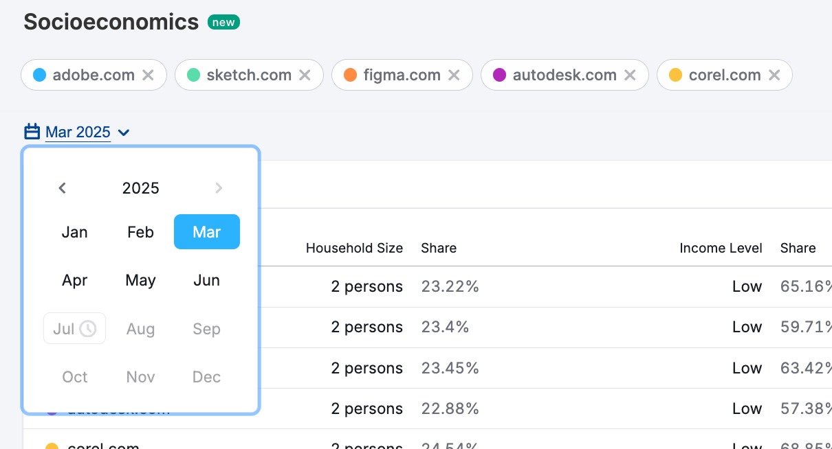
To begin with the Socioeconomics dashboard, select which month you’d like to see data for using the dropdown at the top of the dashboard.
Note: Data in this dashboard is global and reflects both mobile and desktop devices.
Once you’ve selected a month, you can begin exploring the data. The first section of the Socioeconomics dashboard is the Summary.
With the Summary, you can:
- View most common household sizes: Identify the typical household structure within the audience.
- Spot the leading income bracket: See which income range is most represented in the segment.
- Understand employment distribution: Find out whether full-time workers, students, retirees, or others make up the largest share.
- Check top education level: Determine the most common level of educational attainment.
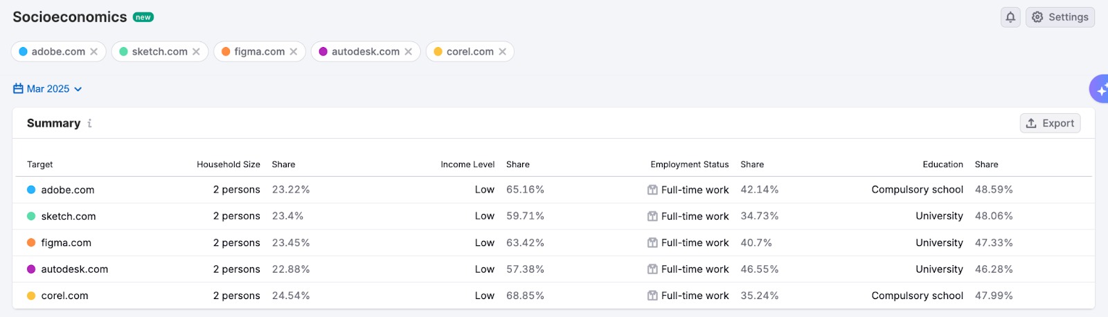
This high-level overview helps you quickly assess which socioeconomic segments stand out before exploring deeper breakdowns.
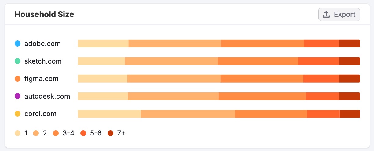
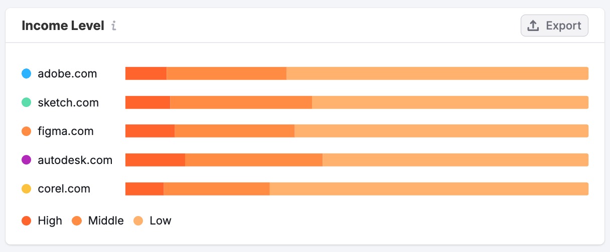
Next, scroll down to reveal the breakdowns for Household Size, Income Level, Employment Status, and Education. With each of the following graphs, you can hover over the bars for a deeper breakdown of the data.
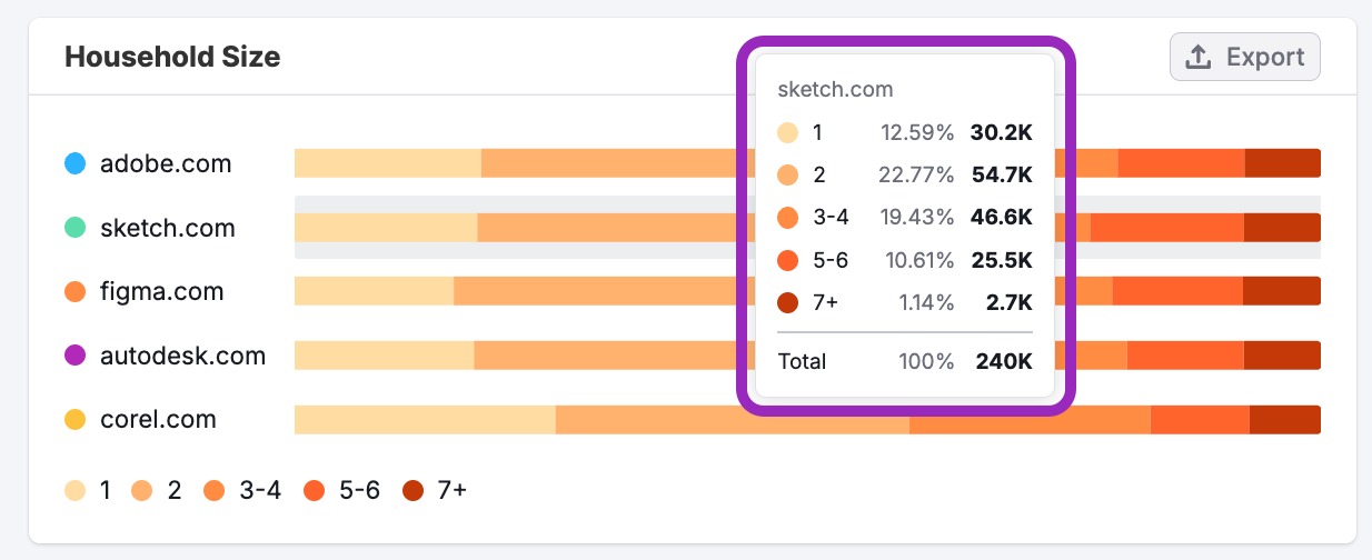
The Household Size graph provides data to help you understand how your audience is spread across different household sizes—from individuals to larger families. This can inform messaging strategies for solo buyers, couples, or households with shared purchasing needs.
The Income Level graph illustrates the distribution of users across low-, middle-, and high-income brackets. These insights help shape pricing strategies, promotional offers, and product positioning based on audience spending potential.
Next you’ll find the Employment Status graph outlines how your audience participates in the workforce. Categories include:
- Employed full-time
- Employed part-time
- Self-employed
- Student
- Retired
- Homemaker
- Unemployed
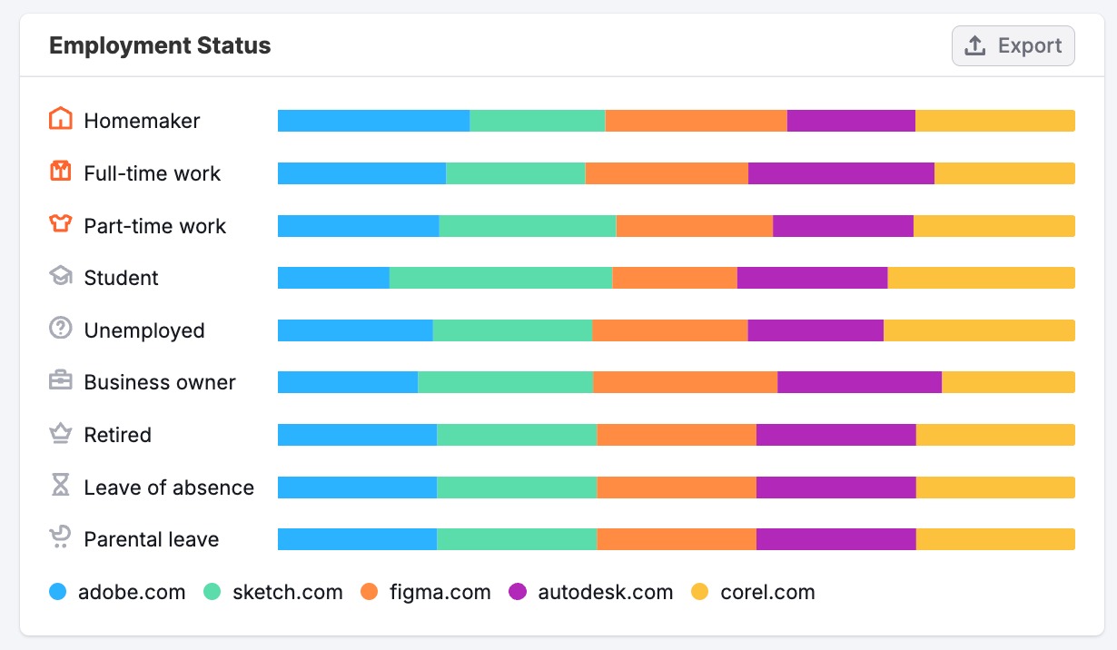
Understanding this breakdown can help you align your messaging with the daily realities and priorities of different user groups—whether that means promoting productivity features for full-time professionals, flexible solutions for students and part-time workers, or easy-to-use tools for retirees and homemakers.
The Education Level graph reveals the highest level of education attained across your selected audience. You’ll see categories for:
- Compulsory school
- Secondary school
- University
- Postgraduate education
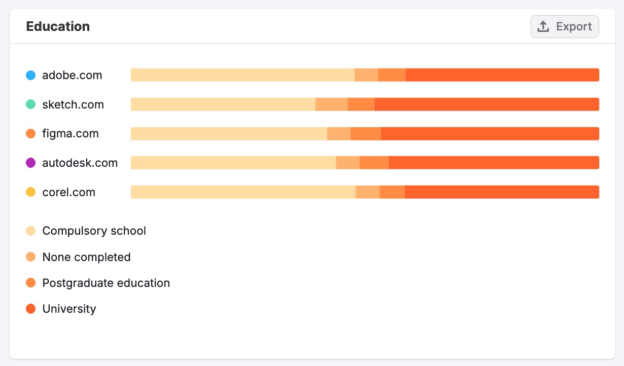
This view can guide the tone and complexity of your content. More advanced audiences may appreciate technical depth or thought-leadership material, while simpler, benefit-focused messaging may resonate better with users who have lower levels of formal education.
What can I do with these insights?
The Socioeconomics dashboard is designed to help you understand your audience’s real-world context so you can market more effectively. Here are a few ways to apply what you learn:
- Refine audience targeting: Segment users by income, education, employment, and household size to reach the right people with the right message.
- Personalize messaging and creative: Tailor your tone, visuals, and offers to match the financial and professional realities of different audience groups.
- Optimize pricing and positioning: Use income and employment data to guide how you frame value, affordability, or premium features.
- Build smarter personas: Combine all four socioeconomic data points to create detailed, data-backed customer profiles for better campaign planning.
By putting these insights into action, you can deliver campaigns that resonate more deeply, reach high-potential segments, and drive stronger marketing outcomes.
What other dashboards should I use?
Combine the Socioeconomics dashboard with these related dashboards for a deeper understanding of your audience:
- Demographics—for age, sex, and other core audience characteristics
- USA—for detailed state-level insights within the United States
- Countries—for performance trends and comparisons across global markets
- Traffic Overview—to explore top-level traffic patterns and engagement metrics
- Top Pages—to identify which competitor pages resonate most with different audience groups
- Audience Overlap—to see how audiences intersect across domains and identify shared or unique segments
These dashboards work together to give you a full picture of who your audience is, how they behave, and where opportunities exist for smarter segmentation and targeting.